Turning Insights Into Action: January Release
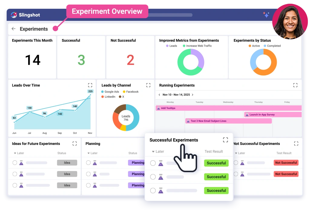
This release introduces five new features that help your team move from data to action faster. Overviews give you personalized dashboards that display tasks, metrics, and goals at a glance. Slingshot as a Data Source makes your Slingshot project data fully queryable inside dashboards, giving you deeper visibility into productivity and outcomes. Conditional Formatting, a native Databricks connector, and weekly chart aggregation give you more control, more context, and clearer insights; all in one platform.
Executive Summary:
This release introduces five new features that help your team move from data to action faster. Overviews give you personalized dashboards that display tasks, metrics, and goals at a glance. Slingshot as a Data Source makes your Slingshot project data fully queryable inside dashboards, giving you deeper visibility into productivity and outcomes. Conditional Formatting, a native Databricks connector, and weekly chart aggregation give you more control, more context, and clearer insights; all in one platform.
Overviews: One View for What Matters

Overviews combine tasks, metrics, goals, charts, and widgets into a unified view and update in real time. You choose what appears, how it’s arranged, how it’s viewed, and what they have access to.
What you can do:
- Create tasks, goals, KPIs, and data widgets
- Pull data from tasks, discussions, pins, or dashboard visualizations
- Personalize your layout or share it with your team
- Interact with your data, drill down, expand charts, or open projects directly
Why it matters:
- Full visibility in seconds
- Links metrics directly to tasks
- No switching between dashboards
Conditional Formatting: Highlight What Needs Attention

With Conditional Formatting, you can apply a color rule based on thresholds to charts and tables on your dashboards. This helps highlight performance thresholds, trends, or risks instantly.
What you can do:
- Apply conditional color numbers for visualizations
- Automatically flag outlying data, targets, or thresholds
- Use color to indicate a plan that is under- or overperforming.
Why it matters:
- Scanning and reading dashboards is way easier
- Elevates important insights so you don’t have to do it manually
- Helps teams focus on what matters
New Data Sources: Bring More of Your Data Into Slingshot

You can now connect additional data sources directly into Slingshot dashboards, including enterprise-scale platforms like Databricks and channel-level sources like Facebook Organic. Bring performance data together with project and task-level work in one centralized view.
What you can do:
- Connect to Databricks workspaces and Facebook Organic data inside Slingshot
- Query live data and visualize organic performance alongside operational metrics
- Blend external data with Slingshot tasks, KPIs, and goals
Why it matters:
- Eliminate manual exports and disconnected reporting tools
- Keep performance data current and centralized
- Give teams a more complete view of execution, engagement, and results
Flagged Notifications: Stay Focused on What Matters
You can now flag important notifications in Slingshot to easily come back to them later—without leaving items unread or letting key follow-ups get lost.
What you can do:
- Flag notifications that need review or action
- Access all flagged items in a dedicated Flagged tab
- Keep your notifications inbox clean and organized
Why it matters:
- Reduce noise and inbox clutter
- Make it easier to track important follow-ups
- Stay focused on priority work without overwhelm

Week Aggregation Level: Visualize Time-Based Trends
Charts in Slingshot now have the option to aggregate on a “week.” This provides flexibility when tracking time-based performance across campaigns, sprints, or goals.
What you can do:
- Set “week” as the x-axis aggregation in charts
- Compare weekly trends across metrics
- Use for sprint tracking, campaign analysis, or recurring reporting
Why it matters:
- Supports agile workflows and weekly reviews
- Provides a consistent view of progress over time
- Easier to spot trends

Slingshot Unifies Execution and Analytics
- Unified View: Get a single, clear view of your work and the business outcomes.
- Real-Time Performance: Access performance metrics and results as they happen, not days later.
- Faster, Smarter Decisions: Make informed choices closer to the data, helping your team understand why and act faster.
Overviews provide immediate clarity. Slingshot as a Data Source provides depth. Conditional Formatting, Databricks, and Weekly Aggregation bring precision and flexibility. By connecting work and analytics, Slingshot puts decisions closer to the data. When your insights and execution live in the same platform, you make decisions with less friction and greater accuracy.
Log in to Slingshot and start using these new features today.
Need guidance? Our team is here to help. Request a demo and see these features in action.
*Some data sources support basic integrations at launch.
Ready to grow your business 10x with AI decision-making?
Request a Free Demo of SlingshotSHARE THIS POST


