Python Data Visualization for Beginners
Using Python to create your data visualizations will help your users gain data insights in milliseconds compared to seconds or even minutes trying to analyze and understand large data sets of unformatted data represented in tabular formats
Executive Summary:
Using Python to create your data visualizations will help your users gain data insights in milliseconds compared to seconds or even minutes trying to analyze and understand large data sets of unformatted data represented in tabular formats
Data visualization plays a significant role in analyzing data and making data clearer and easier to understand by everyone. The visual representation of information with data visualization tools like Python help identify trends, patterns, and correlations that you might have otherwise never discovered, or as the American computer scientist Ben Schneiderman says ‘’Visualizations give you answers to questions you didn’t know you had’’.
In this blog, we will discuss what data visualization in Python is, how to visualize data in Python using Python’s visualization libraries, and present you with some Python visualization examples to help you better understand the power of data visualization and how Python can assist you in utilizing it.
What Is Visualization in Python?
Python is a general-purpose programming language that includes high-level data structures, dynamic typic and dynamic binding, and a variety of other features that make it valuable and beneficial for the development of complex applications.
With the growing importance of data visualization in the last two decades, Python become more than just a programming language. It has grown into the most used programming language for data science, presenting developers with myriad of options to visualize data and gain insights that raw data alone cannot provide them with.
Simply, using Python to create your data visualizations will help your users gain data insights in milliseconds compared to seconds or even minutes trying to analyze and understand large data sets of unformatted data represented in tabular formats. Even better, using data visualization tools in Python lets you add color, trend lines, markers, annotations, and many more visual cues that help the viewer of your visualization instantly understand the story of their data.
Python Visualization Libraries
There are numerous open source and commercial visualization libraries for Python that offer business charts, scientific charts, financial charts, geospatial mapping, and many more. As a developer, you can easily import these libraries into you Python projects, and based on the type of data you have, in a few lines of code you can render a visualization.
These are the 5 most popular Python data visualization libraries:
- Matplotlib – Matplotlib is Python’s first data visualization library and is the foundation library upon which every other Python data visualization library was built. It is the most used and is a 2D plotting library. Matplotlib can generate plots, bar charts, pie charts, histograms, power spectra, scatterplots, error charts, and other types of data visualizations. The library allows absolute control of visualization. It is very powerful, but also very complex – you can create anything, but it takes a lot of work and effort to get reasonable-looking graphs.
- Seaborn – Based on Matplotlib, Seaborn is known to create the most visually appealing Python data visualizations. The library provides a high-level interface for drawing attractive and informative statistical graphics with lesser code required compared to Matplotlib.
- ggplot – This library is Python’s implementation of the ggplot2 data visualization in the R programming language. ggplot is tightly integrated with Pandas library and demonstrates one of the best forms of machine learning after is told how to map the variables to aesthetics and what primitives to use. It can be used to generate simple graphical representations and it cannot be used for creating highly customized graphics.
- Plotly – Plotly allows the creation of both data visualizations and analytics with very few lines of code required and has contour plots which is very uncommon for all other libraries. It can generate many visualizations such as scatter plots, line charts, bar charts, error bars, subplots, histograms, box plots, etc. Furthermore, Plotly has hover tool capabilities that allow detection of outliers or anomalies in a large number of data points.
- Pandas – While not a visualization library, Pandas is an open-source high-performance library that provides fast and, flexible data manipulation and data transformation functions for use in Python visualization libraries. Using the Pandas high-level API for data processing means that you write less Python code for manipulating data to achieve the same results you would with lengthy and complex Python code.
Python Interactive Visualization
If you are looking for Python interactive visualization tool, then you should consider Bokeh.
Bokeh is an interactive visualization library that renders its graphics using HTML and JavaScript. However, Bokeh provides a Python API to create interactive visualizations in D3.js with or without the necessity of writing any JavaScript code. It is suitable for large or streaming data assets and can be used to develop interactive web-based plots, applications, and dashboards. Bokeh is a very powerful tool for exploring and understanding your data and creating appealing custom charts for a project or report. In the Python data visualization space, Bokeh is the #1 candidate for building interactive visualizations.
The library also works closely with PyData tools, and it allows the use of standard Pandas and NumPy objects for plotting.
Python Time Series Visualization
Time series data is the series of data points listed in time order. It is a sequence of successive equal interval points in time and consists of methods for analyzing in order to extract meaningful insights and other useful characteristics of data. The time series type of data is important in many industries such as pharmaceuticals, retail, transportation, finances, and even social media and email marketing companies, as well as many others.
The following are all examples of time series data:
- Medicine: heart rate monitoring, weight tracking, blood pressure tracking, etc.
- Retail: the number of items sold per hour during a 24-hour or 48-hour period
- Transportation: the number of travelers who travel during a one week or one month period
- Economics: gross domestic product, consumer price index, etc.
A line chart is the most commonly used way of visualizing the time series data, usually the chart display allows interactions, like zooming in for more detailed time-based data, or zooming out for more high-level views of data.
A Python Visualization Example
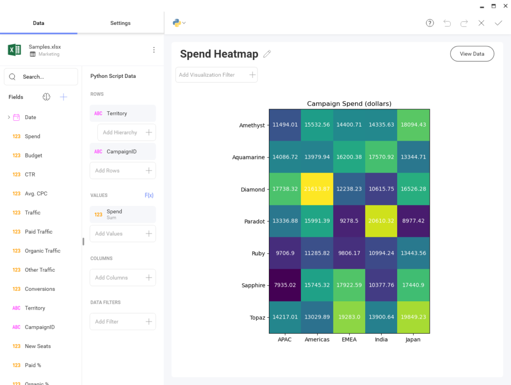
Data visualization and dashboard tools include a wide variety of chart types. Tools like Python and the aforementioned Python graphics libraries can help build useful and informative visualizations when you need to go to beyond the provided chart types. For example, most products don’t include advanced visualizations like Sankey Diagrams, Heatmaps or Steamgraphs. Slingshot makes it easy to add these advanced visualizations in Python.
By default, a Python visualization in Slingshot includes these libraries in your script editor:
#import matplotlib
#import matplotlib.pyplot as plt
#import numpy as np
#import pandas as pd
And by default, the fields available by default in the Script Editor are what you selected from the field chooser in visualization editor:
#data['Territory']
#data['CampaignID']
#data['Sum of Spend']
You are creating your visualization, just like any other built-in chart. The only different, is this one is created with some Python code:
campaignid = np.unique(np.array(data['CampaignID']))
territory = np.unique(np.array(data['Territory']))

spend = np.array(data['Sum of Spend']).reshape((7, 5))

fig, ax = plt.subplots(figsize=(5.5, 6.5))
im = ax.imshow(spend)

# Show all ticks...
ax.set_xticks(np.arange(len(territory)))
ax.set_yticks(np.arange(len(campaignid)))

# ... and label them with the respective list entries
ax.set_xticklabels(territory)
ax.set_yticklabels(campaignid)


# Loop over data dimensions and create text annotations.
for i in range(len(campaignid)):
for j in range(len(territory)):
text = ax.text(j, i, spend[i, j],
ha="center", va="center", color="w")

ax.set_title("Campaign Spend (dollars)")
fig.tight_layout()
Resulting in a beautiful Heatmap visualization that you can easily share with the rest of your team!

Final Thoughts
As businesses continue to rely on data to make better and fact-based decisions, the importance of data visualization will grow even more. And since visualization techniques like charts and graphs are more efficient in terms of understanding data in comparison to traditional spreadsheets and outdated data reports, using tools like Python to create data visualizations are a necessity for every cross-functional team.
However, even with the importance of data and insights, just having them is not enough anymore. To unlock data’s pull potential, you need to turn that data into actions that fit into your daily operations workflow. You can seamlessly transition from insights to action with Slingshot.
With Slingshot, you can analyze data, create beautiful data visualizations, collaborate with everyone within your organization and manage all of your projects with ease, all from the same platform.
Interested in learning more? Try Slingshot for free and see how it can help you leverage actionable insights all while making it easier for your team to utilize data, cultivate a data-driven culture and improve productivity.
Related Articles
Ready to grow your business 10x with AI decision-making?
Request a Free Demo of SlingshotSHARE THIS POST


 Return to Blog


