SaaS Dashboard Examples, Metrics & KPIs
You can start gaining insights into your SaaS product’s performance and make data-driven decisions to optimize your business by tracking these common SaaS metrics:
Executive Summary:
You can start gaining insights into your SaaS product’s performance and make data-driven decisions to optimize your business by tracking these common SaaS metrics:
As the business world continues to shift towards Software as a Service (SaaS), companies are turning to data analytics and business intelligence tools to help them track their metrics and Key Performance Indicators (KPIs) in real-time.
By integrating BI capabilities into your SaaS apps, you can streamline workflows, manage resources and optimize performance. Dashboards and the insights they illustrate help businesses reveal where and how they can improve and optimize their overall processes and performance for maximum profitability.
In this article, we will explore some of the best SaaS dashboard examples and the most important metrics and KPIs to track your business performance.
What Is a SaaS Dashboard?
A SaaS dashboard, or software as a service dashboard, is a business intelligence tool that provides users with real-time visibility and insights into their metrics to drive data-driven decisions. The SaaS dashboards allow users to monitor their performance, track key metrics, and analyze data from various sources in a centralized location.
SaaS dashboards are customizable and can be tailored to specific business needs. They may feature customizable visualizations, real-time alerts, and the ability to drill down into specific data points. Some SaaS dashboards also provide collaboration and communication functionalities that enable team members to be more productive and work together more effectively.
What Metrics Should You Have in Your SaaS Dashboard?
The metrics that you should include in your SaaS dashboard will depend on your specific business objectives. However, you can start gaining insights into your SaaS product’s performance and make data-driven decisions to optimize your business by tracking these common SaaS metrics:
- Product signups: This metric tracks how many people could become paying customers who have signed up to use your SaaS product, even free trial signups.
- Product-qualified leads: A SaaS metric that measures potential customers who have used your SaaS product and reached a pre-defined trigger that showcases a strong potential to become a paying customer.
- Conversion rate: This SaaS dashboard KPI measures the percentage of visitors to your website who convert into paying customers.
- User engagement: Tracks how often users are interacting with your product and how long they are spending on your site.
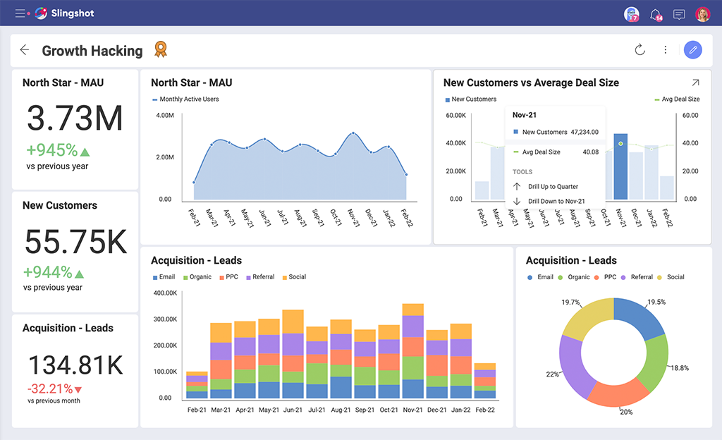
- Active users DAU, WAU, MAU: Also known as stickiness, this SaaS metric shows the active number of users who engage with your SaaS product on a daily (DUA), weekly (WAU), and monthly (MAU) basis.
- Feature adoption rate: How quickly and how many customers are adopting new features or updates to your SaaS product.
- Customer acquisition cost (CAC): This SaaS metric tracks the amount of money you spend to acquire a new customer, including marketing and advertising, and sales expenses.
- Monthly recurring revenue (MRR): The total revenue generated by your SaaS product on a monthly basis.
- Customer lifetime value (CLTV): This is the total revenue a single customer is expected to generate during their entire time using your SaaS product.
- Churn rate: This SaaS dashboard metric measures the rate at which customers are leaving your product.
- Net promoter score (NPS): Measures customer satisfaction and loyalty by asking customers how likely they are to recommend your product to others.
- Customer support response time: How quickly your support team responds to customer inquiries and requests.
- Funnel conversion rate: This metric measures how many customers move from one stage of your sales funnel to the next.
- The average revenue per unit (ARPU): А key metric for SaaS companies as it helps them understand how much revenue they are generating from each customer and how much they can expect to generate in the future. By tracking ARPU over time, SaaS companies can identify trends and changes in customer behavior and adjust their pricing or marketing strategies accordingly.
- North star metric: A key performance indicator (KPI) that represents the core value or impact that a company or product delivers to its customers. It is a single metric that serves as a guiding star for the entire organization, aligning everyone towards a common goal and helping them to prioritize their efforts.
- LTV/CAC ratio: Compares lifetime value to the amount of money spent to acquire them.
- Time Series: Is all about how metrics change over time. Your SaaS dashboard should visualize your key metrics over several months to understand how your efforts impact growth.
Best SaaS Dashboard Examples
SaaS Product Dashboard
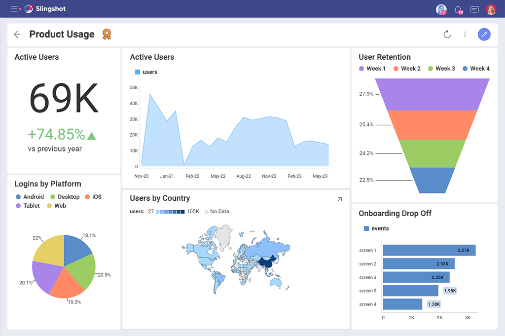
A SaaS product dashboard comprehensively views your product’s performance and user engagement. With metrics and KPIs such as product adoption, user retention, user behavior analysis, and more, you can gain a complete understanding of your product and users. You can use this information to make smarter business decisions to optimize your product to meet your users’ needs better.
SaaS Sales Dashboard
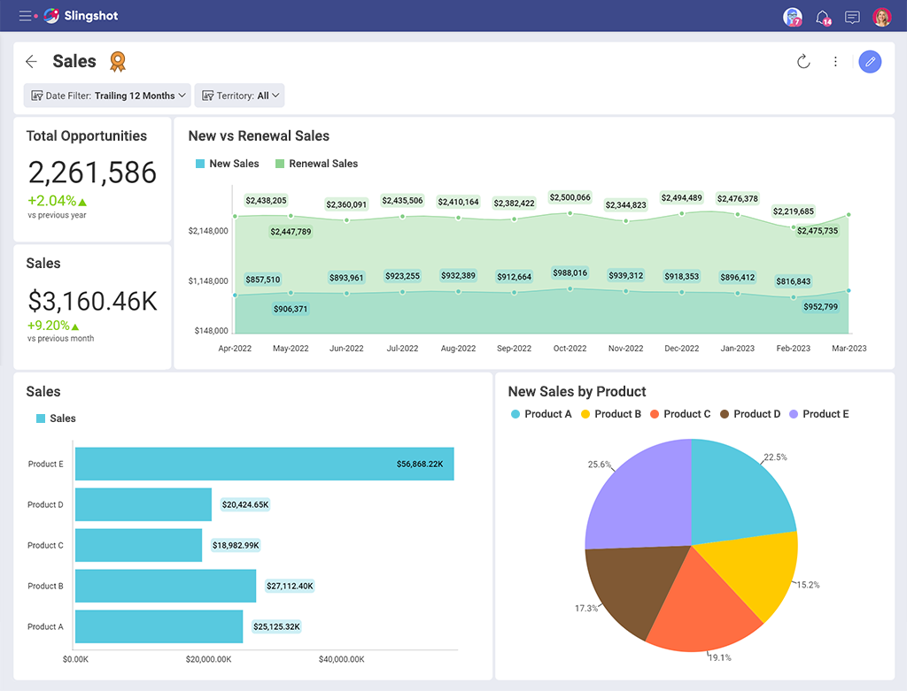
A SaaS sales dashboard is a tool that helps you track and analyze your sales performance. It provides real-time insights into your sales pipeline, customer acquisition, and revenue growth, helping you to identify opportunities for improvement and make data-driven decisions.
SaaS Marketing Dashboard
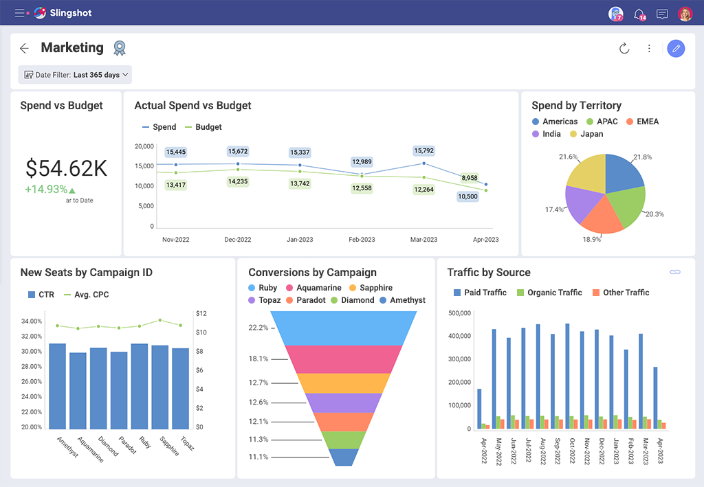
This SaaS dashboard provides instant visibility into the daily metrics that showcase whether the marketing activities are successful and drive leads. You can get real-time insights into your marketing campaigns, lead generation, and customer acquisition, helping you to identify what your users and targeted customers engage with and what you could potentially improve for better results.
SaaS Dashboard for Your Users
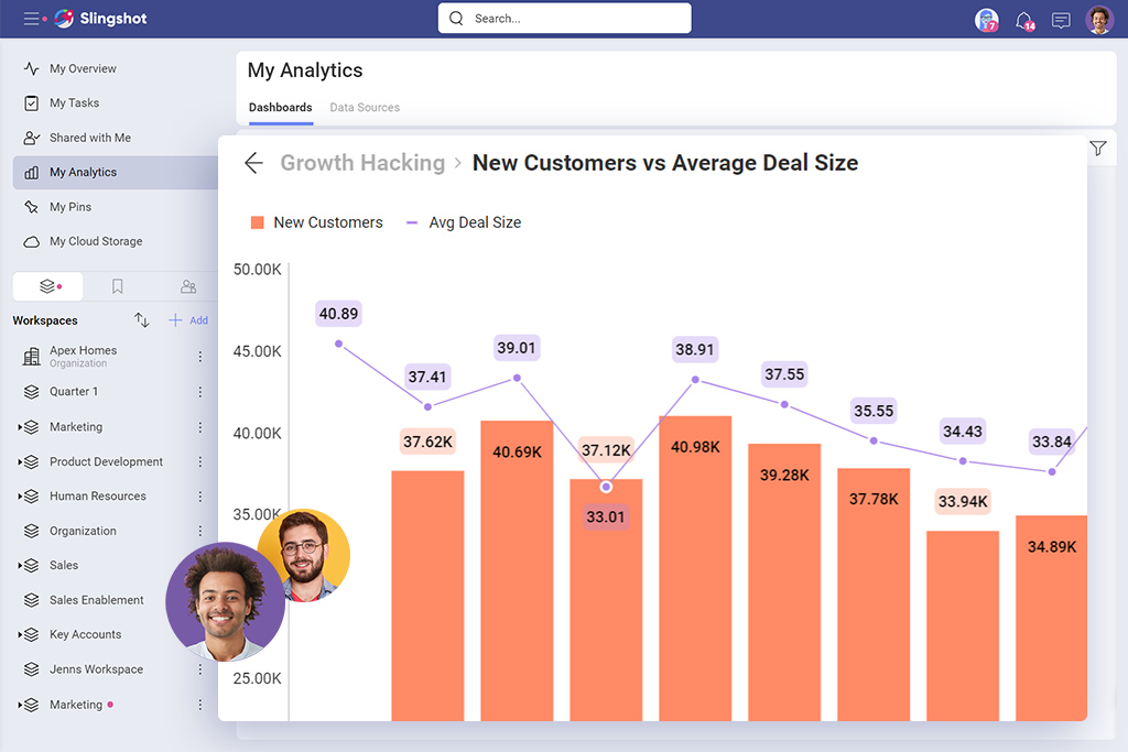
If you have a SaaS product / service and want to offer your users analytics capabilities, then embedded analytics is the right solution for you. Embedding analytics in your SaaS application allows you to improve your customer experience and create a new source of revenue. Analytics capabilities can help your customers view key business data in their natural workflow and easily spot trends and patterns in data that would’ve otherwise been missed. With access to real-time insights, your users can also make better-informed decisions that can guide their business success.
Use Slingshot to Visualize Your SaaS Performance
Slingshot makes it easier for users to be data-driven and quickly find the insights they need by providing them with an extensive catalog of analytics, data sources & sets, visualizations, and dashboards. On top of that, Slingshot is a productivity tool that simultaneously aggregates data analytics, project, task and content management, chat, and goals-based strategy benchmarking – in one intuitive app. Slingshot allows users to easily connect to different data sources, analyze data and create beautiful yet interactive dashboards in just a few clicks.
At its core, Slingshot is centered around data-driven characteristics that help teams stay on top of current data for campaigns through dashboards, KPI tracking, and KPI indicator spreadsheets that are converted into data analytics which are then easily shared. It also offers a set of statistical functions that allow you to receive more insights from your visualizations.
With Slingshot, you can accelerate time to insights and unlock your business data’s full potential.
Not convinced yet?
Try Slingshot for free and see for yourself how it can help you elevate your SaaS application.
Related Articles
Ready to grow your business 10x with AI decision-making?
Request a Free Demo of SlingshotSHARE THIS POST


 Return to Blog