9 Data Visualization Examples and How They Can Help Your Business
Data visualization is a fast and precise representation of your business's performance. It allows you to see and understand the "why" behind your results. Thus, data visualization is the cornerstone of prompt and accurate data-driven decisions. It makes your efforts, team, and entire business strategy efficient and goal driven.
Executive Summary:
Data visualization is a fast and precise representation of your business's performance. It allows you to see and understand the "why" behind your results. Thus, data visualization is the cornerstone of prompt and accurate data-driven decisions. It makes your efforts, team, and entire business strategy efficient and goal driven.
Data visualization is nothing new. However, its importance is continuously growing. So, unlike a decade ago, today, utilizing visualization to make data-driven decisions is no longer a mere suggestion.
Fortunately, with current technologies, you don’t have to allocate resources and time and dedicate an entire team to creating a single graph. Instead, you can get one with a click of a button.
We will discuss how easy it is to visualize your data today a bit later on. For now, let’s focus on why it’s still so relevant and what types are there. We will also provide 9 data visualization examples and explain how they will enhance your business strategizing, team efforts, and overall results.
Data Visualization Explained
Data visualization is increasingly becoming a pillar of stability in all organizations, regardless of industry or niche. That’s hardly a surprise, considering the amount of data companies collect and generate annually. A decade ago, collecting data from users was innovative and groundbreaking.
Today, this is the standard for anyone willing to grow their business and maintain market stability. In fact, over the past 12 months, companies worldwide have created, captured, copied, and consumed over 149 zettabytes of information. This trend is only growing as experts suggest by 2028, the consumption will reach just shy of 400 zettabytes.
Data tells a story – and visualizations are there to help us understand it.
Moreover, Data Visualization is becoming increasingly vital when motivating your team. It allows C-level executives to communicate company goals more efficiently.
According to a recent Slingshot survey, only about 23% of employees understand what they are working toward. This affects their motivation, as over half of the employees in all age groups confess that they expect their managers to be transparent about company goals, objectives, and key results.
So, using data to drive your success is nothing new. Nor is the idea of using visual aids to understand and communicate raw data. However, today, communicating the gathered data clearly and efficiently is much more important for decision-making, aligning each one of your teams, and motivating them toward a common data-driven goal.
Data Visualization Types
Until recently, infographics were the go-to data visualization method. However, executives, project managers, and even regular employees are moving towards informative and flexible dashboards. This is mostly due to how easy it has become to create visually stunning data visualization without the need for designer or developer knowledge. Dashboards are easily customizable and combine various data visualization elements depending on your tasks, role, and needs.
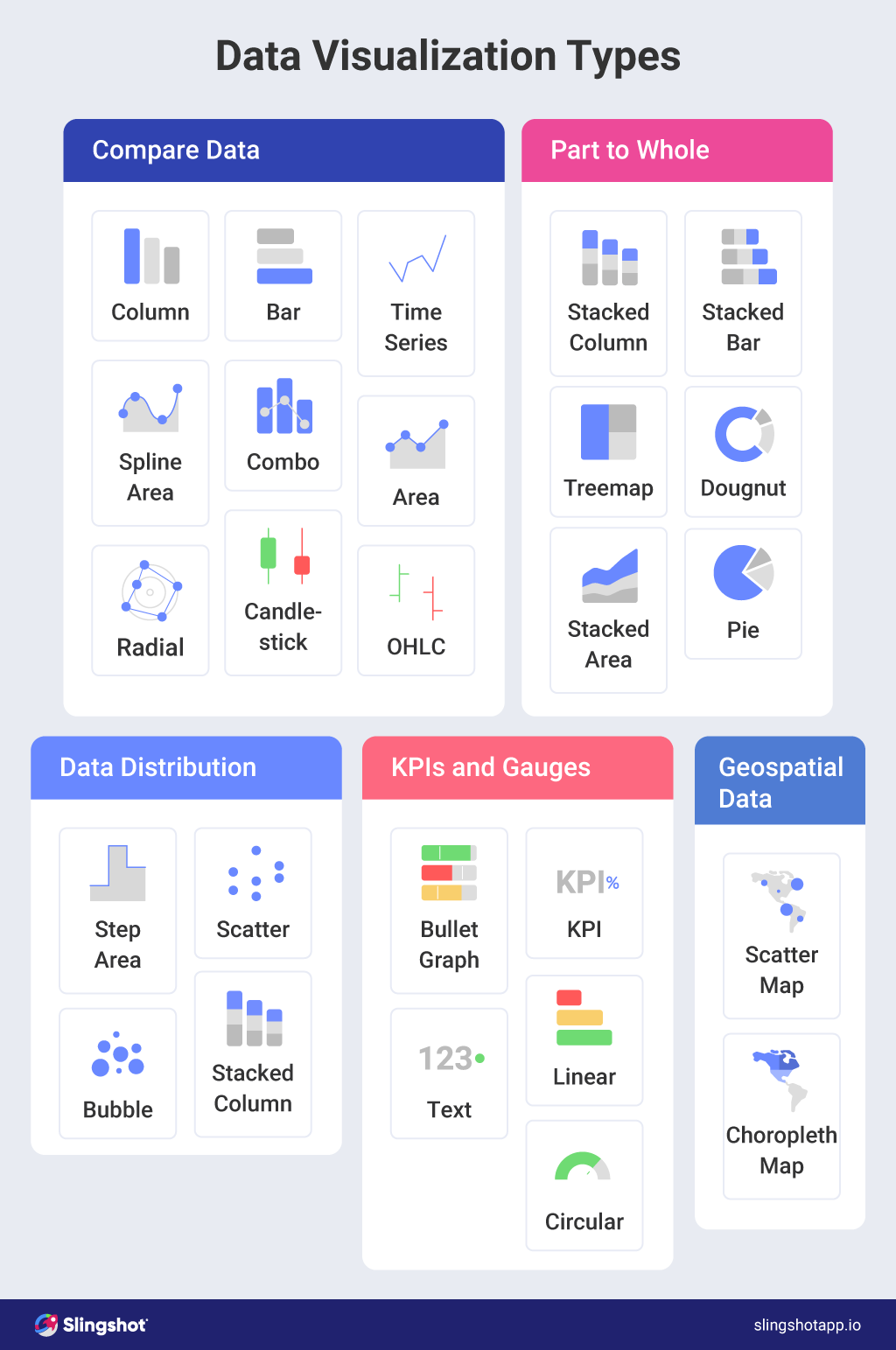
Some of the best data visualization examples use common elements:
Bars, Columns, and Graphs
Bars, columns, area charts, and similar graphs offer a quick overview of comparative data. Combining these elements in a dashboard will give you a clearer picture of various data side-by-side. This will show correlations, causations, and dependencies between events, stats, and KPIs. For example, you can see a correlation between a specific ad and increased product sales.
However, adding a column in the same dashboard may show that the sudden surge in product popularity was due to a different factor – like when the ad was promoted.
Pie Charts and Stacked charts
You can use a number of pie and stacked charts to see whether each part of the whole is pulling its weight. This way, for example, you can see what percentage of your marketing budget goes to a specific channel. At the same time, stacked charts can show how many leads each channel brings. This will help you better allocate finances and company resources in the most profitable channel.
Scatter and Bubble
Scatter and bubble data can show you the distribution and relationships between various categories of data. They use colored circles to represent specific data; its size depends on the data volume.
So, for example, if you want to see what type of customers have the biggest lifetime value related to the single-time purchase value, this graph can show it in seconds.
Such graphs may show that males between 25 and 35 make more profitable one-time purchases, but female clients between 35 and 45 have longer lifetimes and higher overall value.
Line, Spline, and Candlestick charts
Line, spline, and candlestick charts are invaluable in showing trends. They allow you to compare various factors over the same period, clearly showing the why behind the what.
For example, you can compare several products to see how much revenue each one brought your company from what customer group. This is invaluable information for marketers trying to pinpoint the right buyers with the right product.
Indicators and Gouges
These types of data visualization are helpful for following your KPIs. With various indicators and gouges, you can quickly discover how a particular project, campaign, or number is performing versus how they are expected to perform.
Any CEO needs to know precisely where every aspect of their business is. More importantly, if the goals are lagging, they must be able to see if they need to intervene. These data visualization tools will do just that.
The Best 9 Data Visualization Examples
Data visualization is only effective if you manage to create a role or problem-specific dashboard that tells you the whole story. So, unsurprisingly, the best data visualization examples are often role-specific. They illustrate data connected with typical key decisions that executives of different branches often need to make based on facts rather than whims.
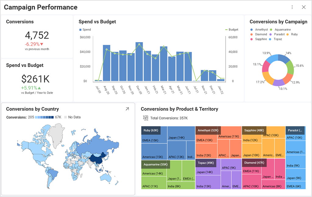
Marketing Performance Data Visualization
Marketing specialists generate a lot of data through digital marketing campaigns. Utilizing this data can literally make or break your business. So, of course, these metrics are the foundation of data visualization in marketing performance.
Through them, we can check out:
- The overall ROI
- Effectiveness of a project/campaign
- Level of performance
- Goal accomplishment.
In marketing (and the very popular ABM marketing), dashboards are mostly used to check out vital metrics like interactions and conversions, visits, landing page performance, website traffic, etc.
Unsurprisingly, this is one of the most popular data visualization examples out there. It’s the drivetrain behind any marketing campaign success.
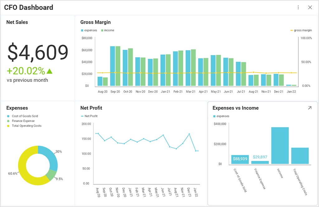
Finance Data Visualization
Another outstanding example of data visualization comes from the financial department. While marketing may be the heart of any organization, finances are the blood that makes it pump.
Finance data visualizations can provide other team members with valuable insights into the company finances without the need for lengthy explanations or Excel and financial software know-how. The financial visualizations usually track:
- Payroll
- Budgets
- Cash flow
- Liquidity
- Expenses
- Others
CFOs can involve stakeholders in financial analysis, helping them make financially stable and adequate decisions regarding their branch.
These data visualization examples can apply to any business. For example, through data visualization in accounting, executives can always be on top of the company’s financial situation. Still, this example is probably best utilized in financial niche companies.
Sales Data Visualization
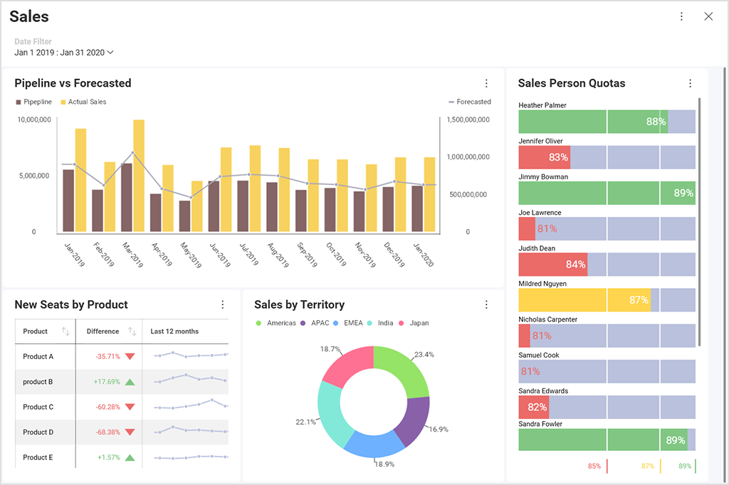
Sales is one of these departments where every single number must be tracked. This ensures you can replicate successes and avoid repeating failures. It’s the only way a company can have stable growth over a prolonged period.
So, of course, the best data visualization examples often include metrics like:
- Customer growth & retention
- Customer lifetime value
- Customer acquisition cost
- Average avenue per unit
- The average length of the sales cycle
- Quota attainment
Gaining insight into the sales KPI through sales data visualization is essential for taking the necessary daily, weekly, or quarterly actions.
For example, you can follow the sales pipeline and find where the process can be optimized to save money and effort.
Product Development Data Visualization Examples
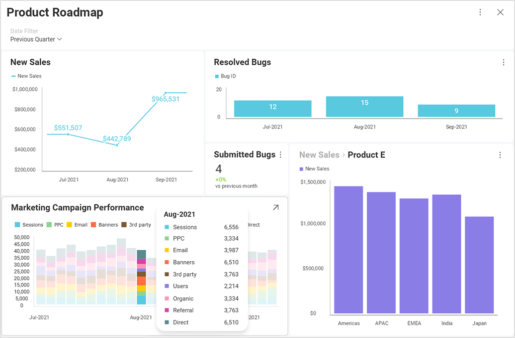
The product is the center of your operations. Thus, knowing how your product development is coming is as important as following the marketing, sales, finances, and any other aspect. Therefore, the product roadmap is another must-have for any company striving to grow consistently.
This product visualization is crucial for product managers and product owners. It allows them to follow timelines and plan accordingly. Moreover, they are always on top of any blockages along the way and can mitigate any potential delays.
Project Management Data Visualization
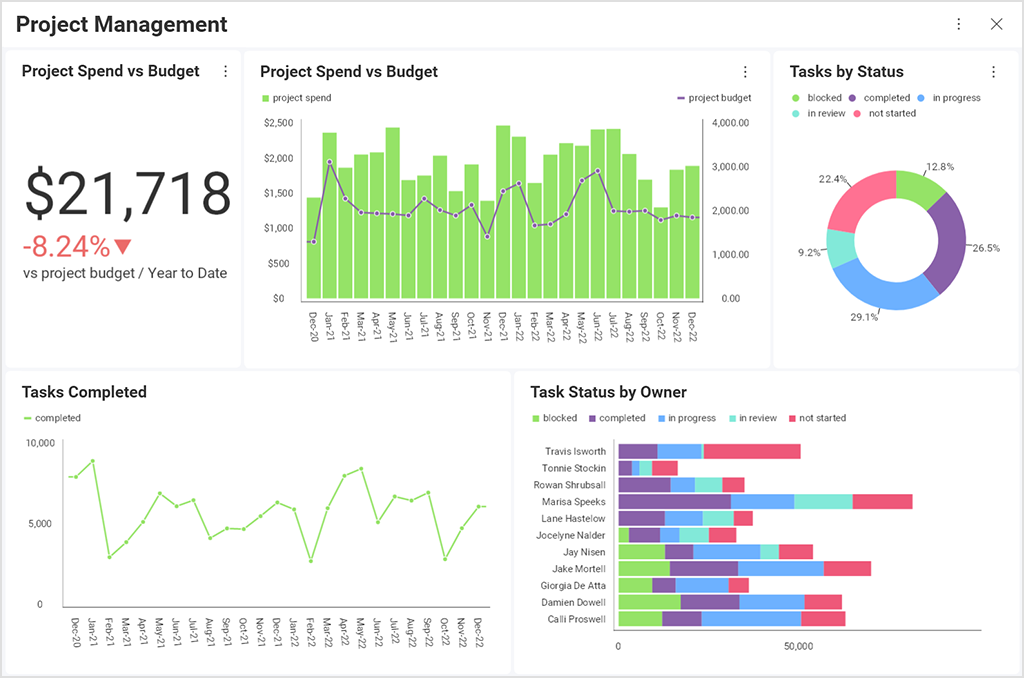
A team is only as good as their manager. Managers, on the other hand, are dependent on the data they receive. Thus, having a dedicated dashboard for project managers is crucial to any company’s success.
Team performance, budget, following timelines, and KPIs are the most important metrics for a project manager.
Gathering this data the old-fashioned way means missing opportunities and deadlines and making uninformed decisions. Today, however, one can draw all of this into a single dashboard, making the entire process much more efficient.
More importantly, managers can monitor their team’s productivity daily or hourly with project management data visualization. So, for example, if a team is more productive in the morning, the manager can let them work instead of distracting them with meetings or tasks that are barely essential.
SEO Management Data Visualization Examples
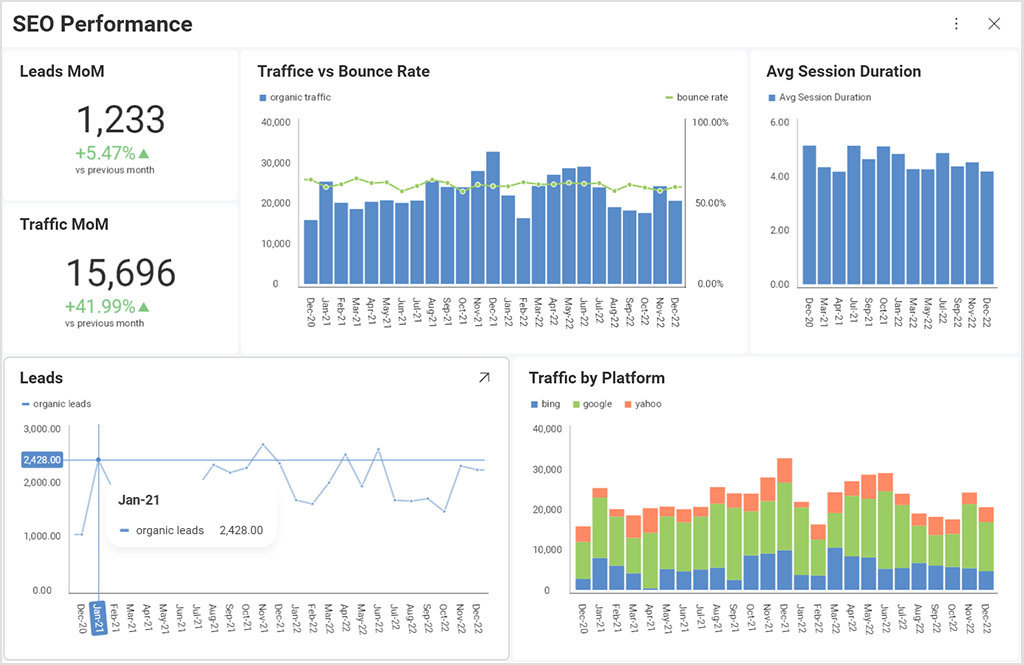
Good visualizations can tell a great story when it comes to reporting on SEO and marketing campaigns. If you work with in-house SEO specialists or an external agency, team leaders need to know how the website performs in organic search. But that’s not an easy task as most SEO data comes from multiple sources – Google Analytics, Google Search Console, and rank trackers.
The SEO dashboard example below shows the most important KPIs for organic channels (Leads/Sales) vs. the previous month and in a timeline. Sales data, in a combination of engagement metrics like bounce rate and Avg. Session duration can give an excellent overview of how users consume the content on the site and can identify issues or areas for improvement. Depending on business type, particularly businesses impacted by seasonality, MoM comparisons might not be the best choice. For such, year-over-year comparison (YoY) might be the better choice. Annotations highlighting specific events can add clarity to the dashboards (holidays, Google algorithm updates, technical fixes).
SEO Management
Manage and follow up on your SEO projects with this dashboard and project template.
Use Template →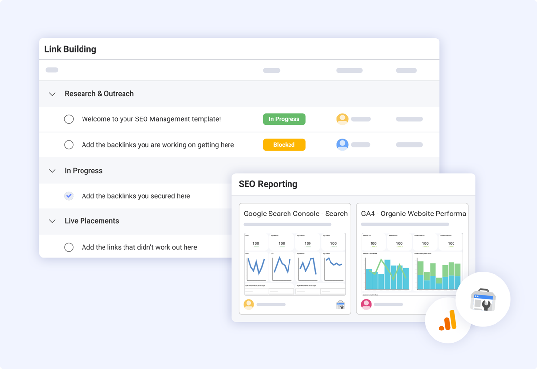
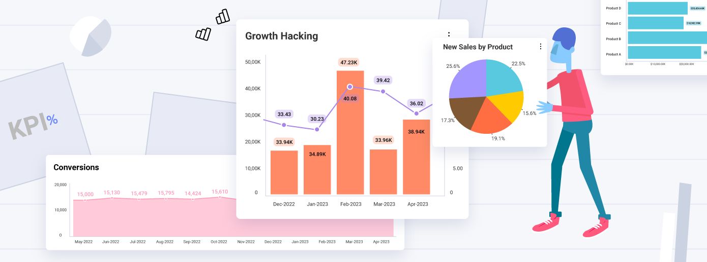
Growth Hacking Data Visualization
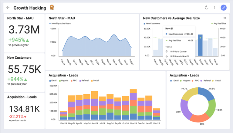
Rapid, sustainable growth is the goal of any company striving to succeed. Growth hacking is the most effective way to achieve it. Unlike the traditional marketing approach, growth hacking allows for agility, innovations, and creative use of company resources.
However, to be effective, growth hackers rely heavily on data. Thus, reading and understanding crucial numbers at one glance is essential for their efficiency.
So, using data visualization to follow their A/B tests, referral programs, or other experiments allows growth hackers to find the best growth strategy faster, easier, and more accurately.
Data Visualization for Developers
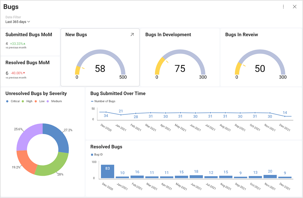
Data visualization used by developers is a secure way to close the knowledge gap between them and other departments. For instance, while marketers and copywriters may be familiar with the product, they are not always IT specialists. So, such data visualization is crucial, as communication between development and marketing is a cornerstone of success.
IT is a highly specific niche requiring a lot of know-how and experience. Still, for a product owner, CFO, and other C-level executives, tracking how their developers’ teams are doing is of utmost importance. Tweaking budgets, aligning product roadmaps, and creating a viable timeline will reduce the overall stress on the team and the entire company.
Thus, it’s crucial for managers to visualize project presentations, bug tracking in real-time, examples, progress, and results to really start making data-driven decisions faster.
Content Calendar Data Visualization
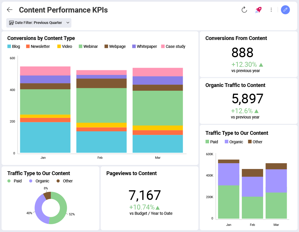
Content is the voice of your brand. So, of course, you must find the right tone of voice and know how to communicate with your audience.
For big brands, content is a team effort. Thus, sharing crucial information, like timelines, performance stats, SEO scores, and others, will enhance the workflow and allow better real-time collaboration.
For example, your content writers may need to see the most effective blog posts to study how to replicate their success. So, instead of going through Google Search Console and GA4, they can simply get the results from a centralized space.
Thus, content calendar data visualization is crucial for any company, regardless of industry, niche, or size. While small companies can manage without one, this data-visualization example is a must for mid and large-sized businesses that employ entire content teams.
Create Your First Data Visualization with Slingshot
Data visualization, unfortunately, often takes a lot of time, resources, and effort to prepare. Unless you use Slingshot. We are the most robust AI-enhanced data visualization tool on the market, allowing you to effortlessly generate the best data visualization examples we gave and countless others.
It takes less than 5 minutes to build a stunning dashboard filled with all the data you’ll need.
But Slingshot is much more. It’s an all-in-one digital workspace and a tool that can aggregate data analytics, project and information management, chat, and goals-based strategy benchmarking.
Furthermore:
- You can quickly connect to your different data sources and create dashboards within minutes.
- Slingshot is fully integrated with Azure Machine Learning Studio in Analytics, so you can choose your data source, build visualization, and connect to a trained machine learning model.
- Slingshot supports Google BigQuery, adding significant speed in processing big data with analytics, allowing for usage of huge datasets in seconds.
So, if you want to make fast and data-driven decisions, Slingshot is the data visualization tool you need.
Enhance your decision-making! Build your first dashboard with our step-by-step guide.
Related Articles
Ready to grow your business 10x with AI decision-making?
Request a Free Demo of SlingshotSHARE THIS POST


